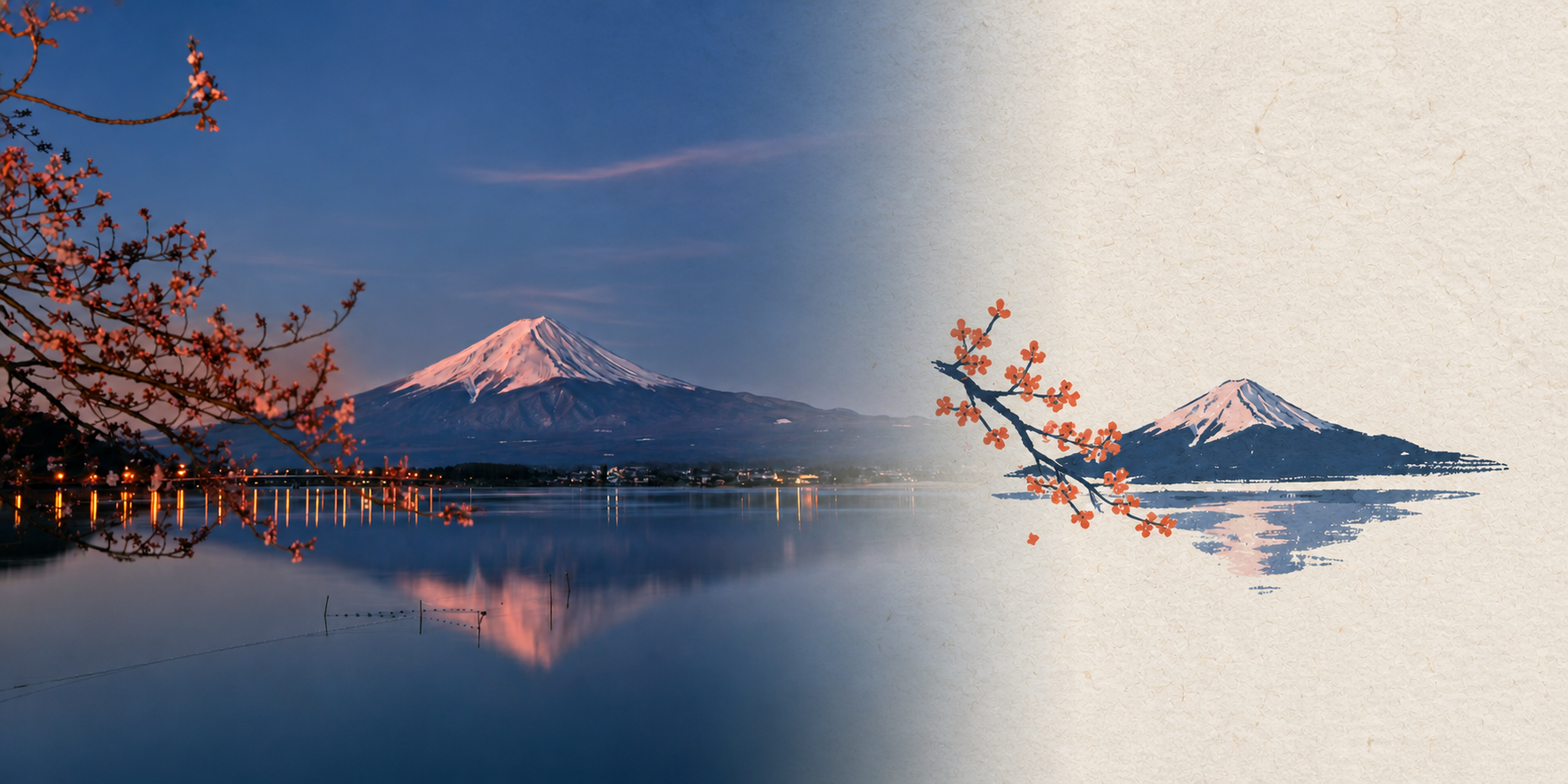
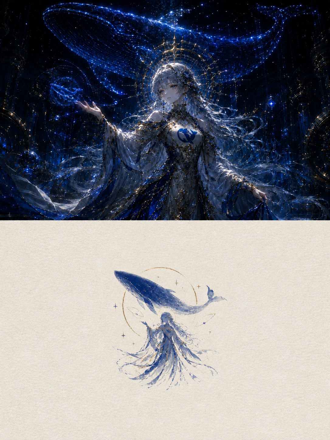
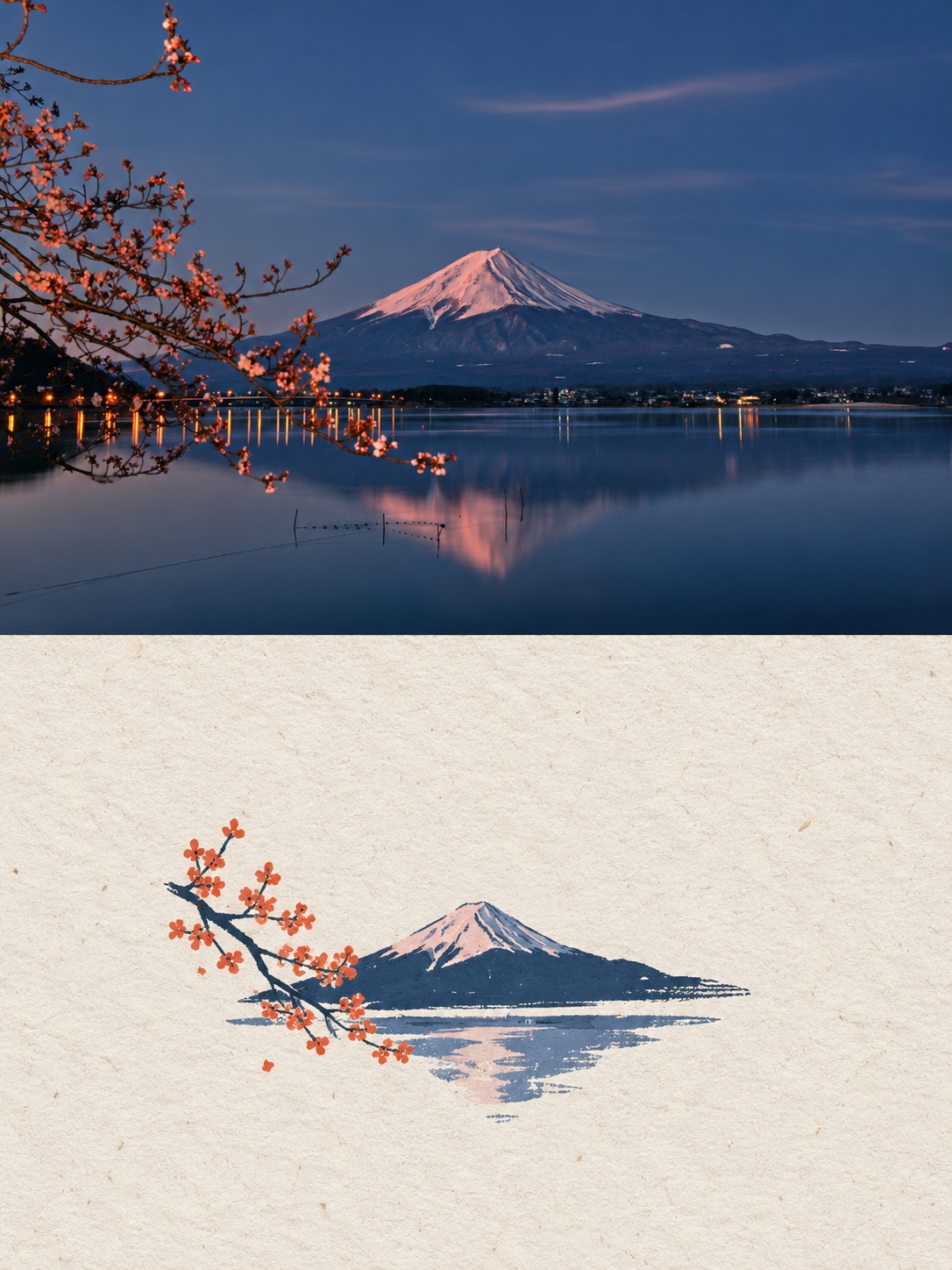
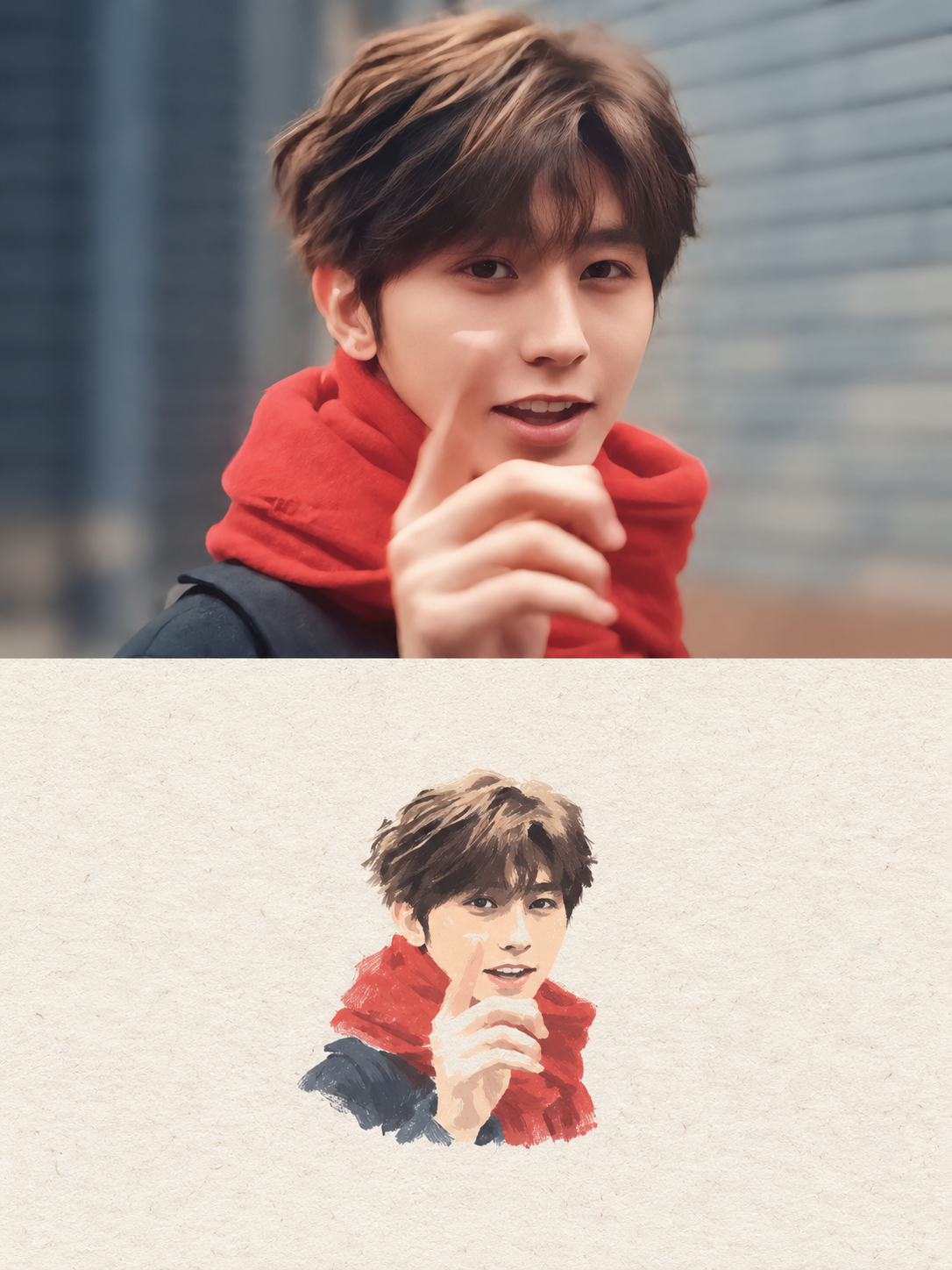
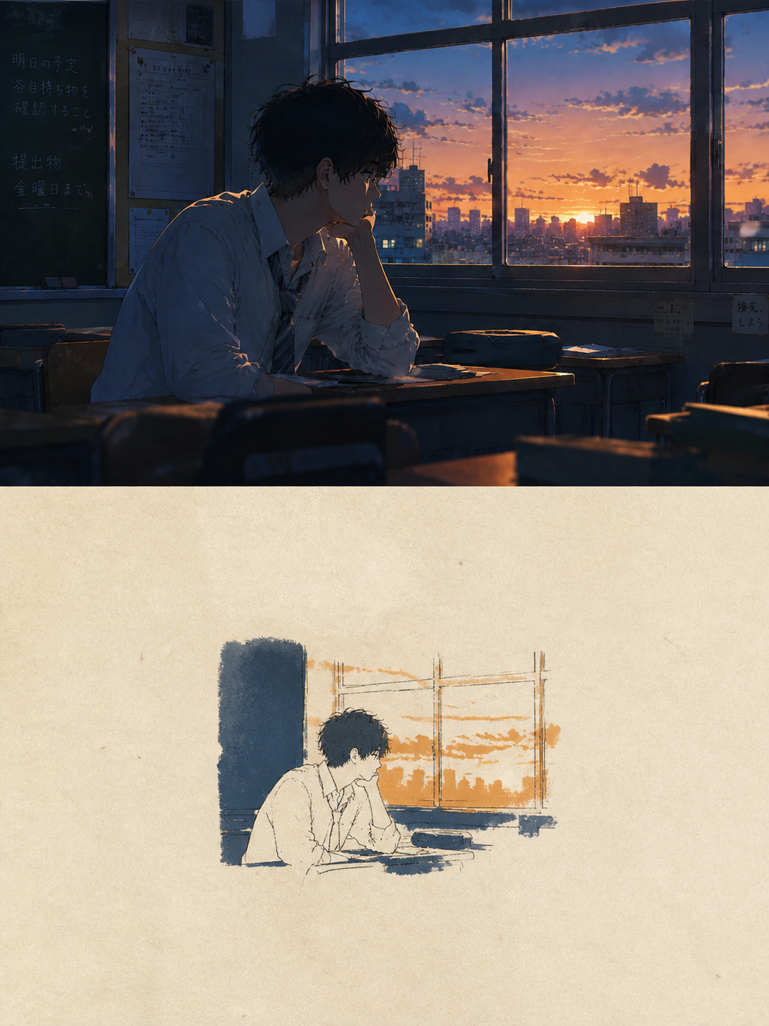
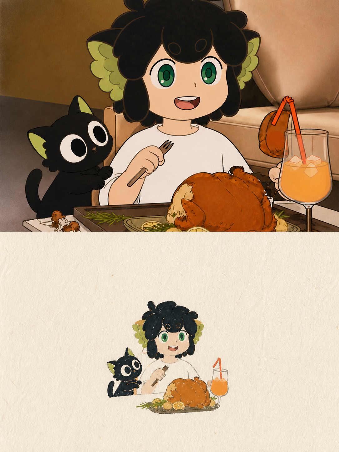
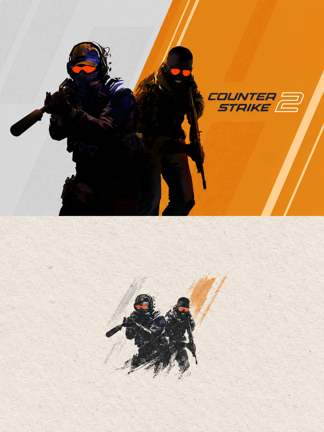
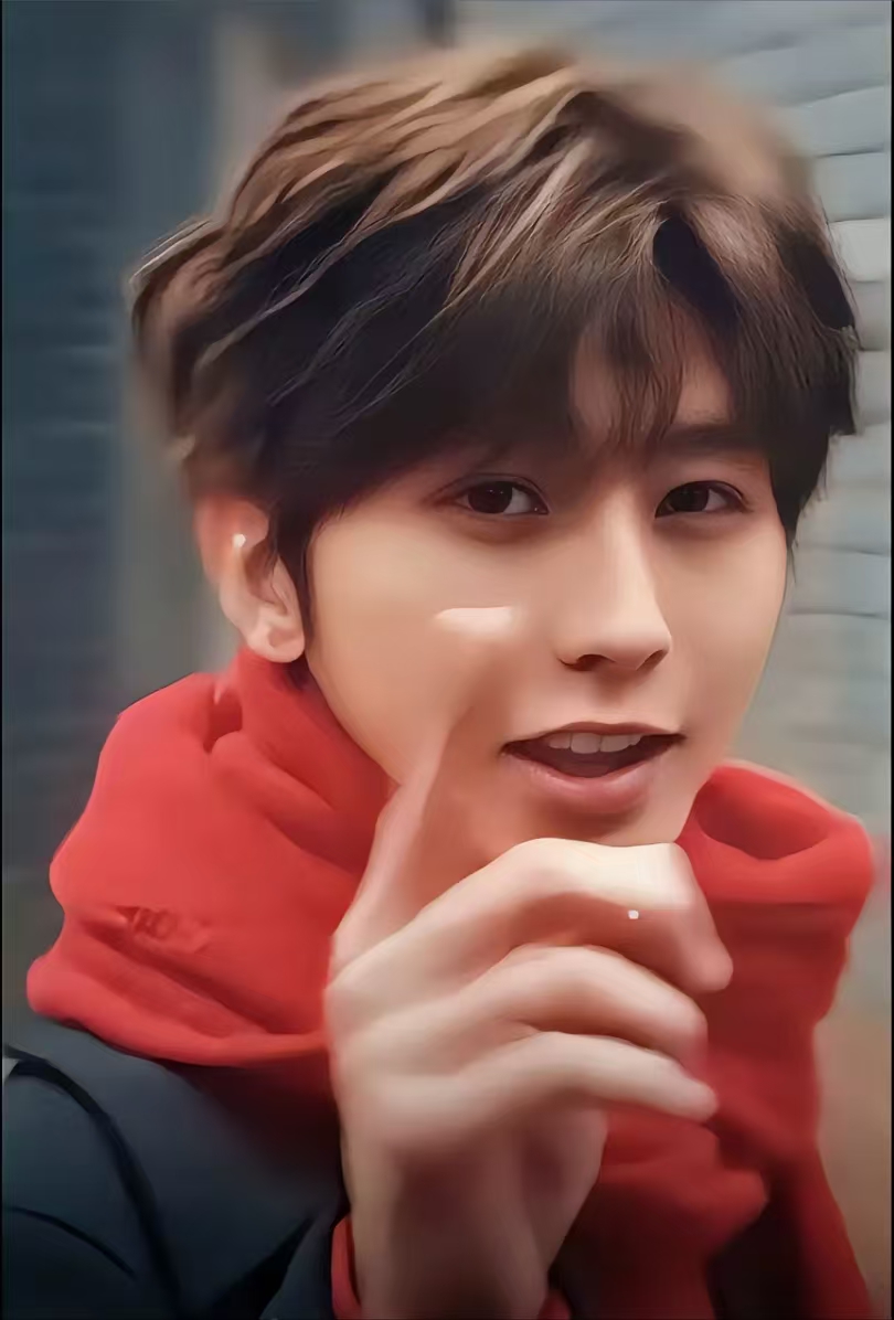
Create one independent high-end editorial poster for each uploaded photo. Do not combine multiple photos into a collage. Each photo must be processed and output as a separate poster.
OVERALL FORMAT
Strict 3:4 vertical composition.
Divide the canvas horizontally into two exactly equal sections, with a precise 1:1 height ratio.
The top half occupies exactly 50% of the canvas.
The bottom half occupies exactly 50% of the canvas.
The two sections should feel visually connected as one refined art publication cover.
TOP HALF — ORIGINAL PHOTOGRAPH
Preserve the original photograph as faithfully as possible.
Keep the main composition, subjects, identity, facial features, body proportions, poses, expressions, clothing, objects, and spatial relationships unchanged.
Preserve the realistic photographic texture, natural lighting, shadows, atmosphere, and original color mood.
Apply only subtle, sophisticated editorial color grading, creating the feeling of a premium magazine photograph, contemporary art book, or high-end independent publication.
The image should remain photorealistic and authentic, never overly retouched or artificially stylized.
If necessary to fit the 3:4 composition naturally, extend the sky, ground, walls, or surrounding environmental background. Background extension must feel seamless and photographic.
Never stretch, distort, reshape, replace, or alter the main subject.
BOTTOM HALF — MINIMAL HAND-DRAWN PAPER ILLUSTRATION
Extract the most recognizable visual elements from the original photograph and reinterpret them as a minimalist hand-drawn paper-cover illustration.
Preserve:
- The most recognizable subject - Essential silhouette and proportions - Key pose or gesture - Important objects - The core narrative relationship between people and objects
Highly simplify the image. Remove unnecessary details and retain only the visual information needed for immediate recognition.
Use:
- Delicate, slightly imperfect hand-drawn lines - A small number of bold, clearly defined acrylic-style flat color shapes - Rough paper texture - Visible handmade brush marks - Slightly irregular, organic edges - Subtle imperfections that make it feel genuinely handmade
The main illustrated subject should be small, centered, and carefully composed, occupying approximately 10–20% of the bottom half.
Leave a large amount of negative space around the illustration.
The background should primarily resemble:
- Rough white paper - Warm off-white paper - Pale natural paper - Minimal editorial book-cover stock
Use only a few lines or small color shapes to suggest the surrounding environment.
COLOR PALETTE
Extract the dominant colors directly from the original photograph.
Compress the palette into no more than 4 main colors.
Keep the colors restrained, sophisticated, and harmonious.
Use bold but controlled flat color blocks.
Avoid excessive color variation.
Preserve subtle paper grain and handmade brush texture.
The illustration should visually feel like a simplified color interpretation of the photograph.
TYPOGRAPHY
A small amount of simple typography may be included when appropriate.
Possible elements:
- A short title - Keyword - Object name - Location - Year - Number - Short phrase
Text should be minimal, understated, and editorial.
Typography should naturally interact with the large areas of negative space and the small illustration, evoking:
- Art book covers - Independent publishing - Contemporary editorial design - Thoughtful children's picture books
Do not force text into the composition if it does not naturally fit the photograph.
“A small subject surrounded by a large amount of empty space.”
The result should resemble a carefully designed independent art publication cover, rather than a commercial advertisement.
使用时,我会特别检查这些地方
生成完成后,不要只看“好不好看”,还可以按下面几项快速检查:
画布是否真的是 3:4,分界线是否位于正中间。
上半部有没有改变人物身份、五官、姿势或关键物件。
下半部是不是在提炼,而不是简单复制或套滤镜。
插画主体是否足够小,四周是否保留了真正的大面积留白。
主色是否来自原图,是否控制在四种以内。
多人物画面中,人物和物件的关系有没有被保留。
纸纹、刷痕和边缘是否自然,而不是统一的数字噪点。
如果模型总是把插画画得太大,可以把 occupying approximately 10–20% 提高优先级,再补一句 Do not enlarge the illustration to fill the lower half.。如果人物被改动,则应重复强调 identity preservation,并改为单图生成,减少模型同时处理多张图时的注意力分散。